UX audit
Full heuristic review identifying the friction costing conversions.
A conversion-led redesign of a large sportswear & active-lifestyle retailer — paying down years of UX and technical debt to make catalogue, product and checkout faster, clearer and measurably better for business.
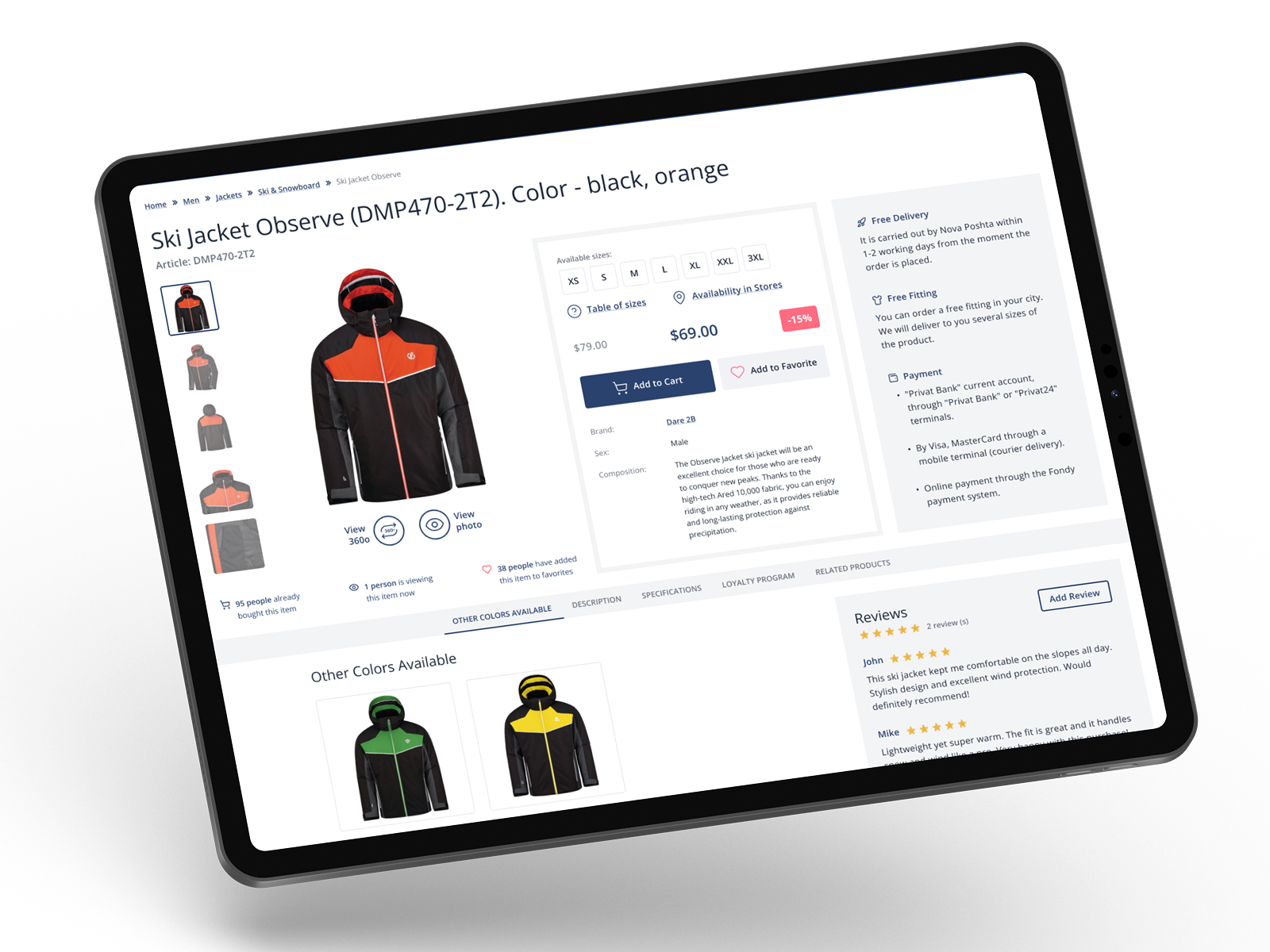
Marathon is a large sportswear and active-lifestyle retailer with a wide network of physical stores and an established e-commerce platform serving a broad customer base across multiple categories and brands.
This wasn't a reskin. The brief was explicit: improve business performance, not just visual appearance. That meant closing the gap between where users dropped off and where the business needed them to go — through research, architectural changes and conversion-led design.
Full heuristic review identifying the friction costing conversions.
Data-informed changes to catalogue, product and checkout flows.
Sessions and analysis that surfaced the wishlist insight driving change.
Restructured navigation and category hierarchy for a 10k+ catalogue.
End-to-end strategy from discovery to post-purchase for retail.
Full redesign of home, catalogue, product, search and account.
Streamlined the funnel to reduce drop-off at every payment step.
Rebuilt filtering for a wide catalogue — faster, cleaner, smarter.
The platform had accumulated significant debt — an outdated interface, poor information architecture, complex navigation and a slow, friction-heavy checkout. Each issue, individually manageable. Together, they quietly suppressed every conversion metric the business cared about.
One principle across every surface: shorten the path to a decision. Cleaner navigation, a product page that answers objections, and a checkout that doesn't get in the way — all rebuilt on a responsive system.
The old hierarchy hid products behind ambiguous categories. The redesign opens with a clear catalogue — breadcrumbs, tidy subcategory tiles and a persistent filter rail — so a shopper goes from “Men” to the exact jacket without guessing.
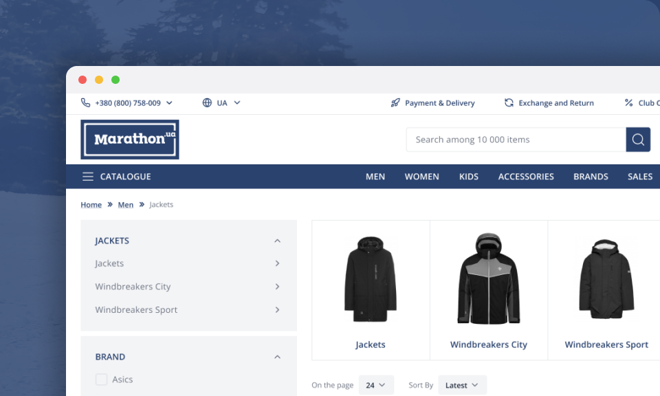 Web · Catalogue & filters
Everything a buyer needs to commit sits above the fold — gallery, sizes, price and discount, and a prominent add-to-cart — with delivery, fitting and payment reassurance alongside.
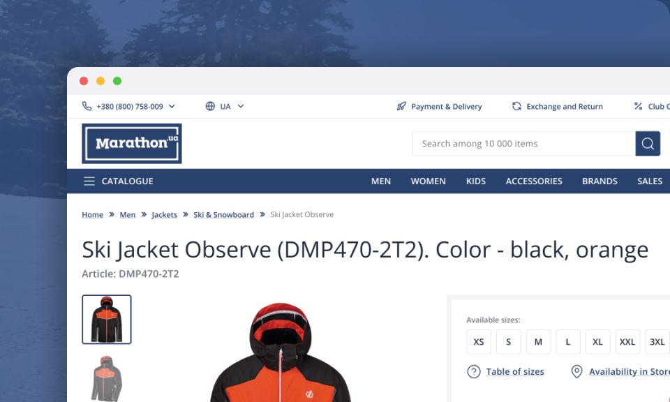 Web · Product header
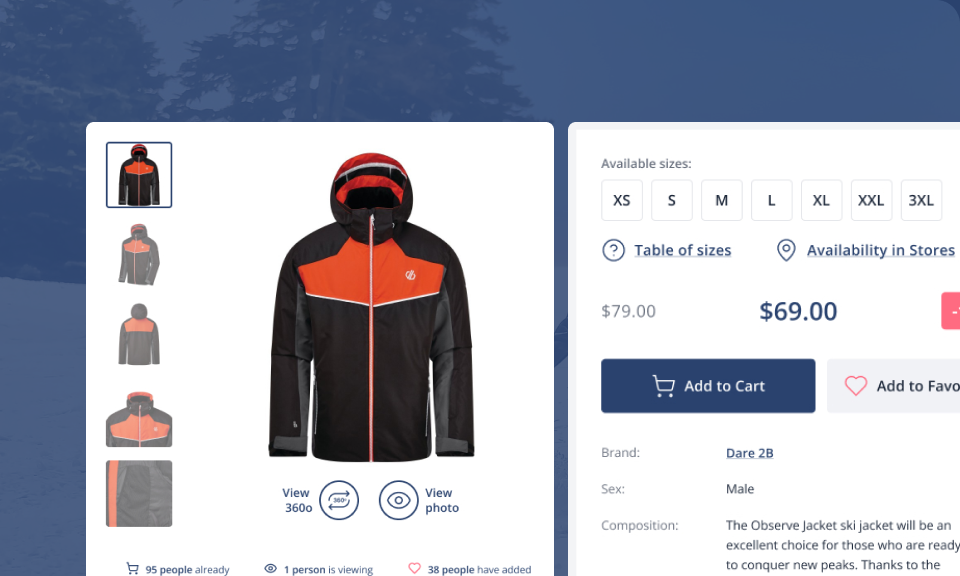 Web · Buy box
With 10,000+ items, discovery is the conversion lever. A faceted rail — category, brand, gender, size and price — plus clear sort and per-page controls let shoppers carve a huge catalogue down to a short, buyable shortlist on any screen size.
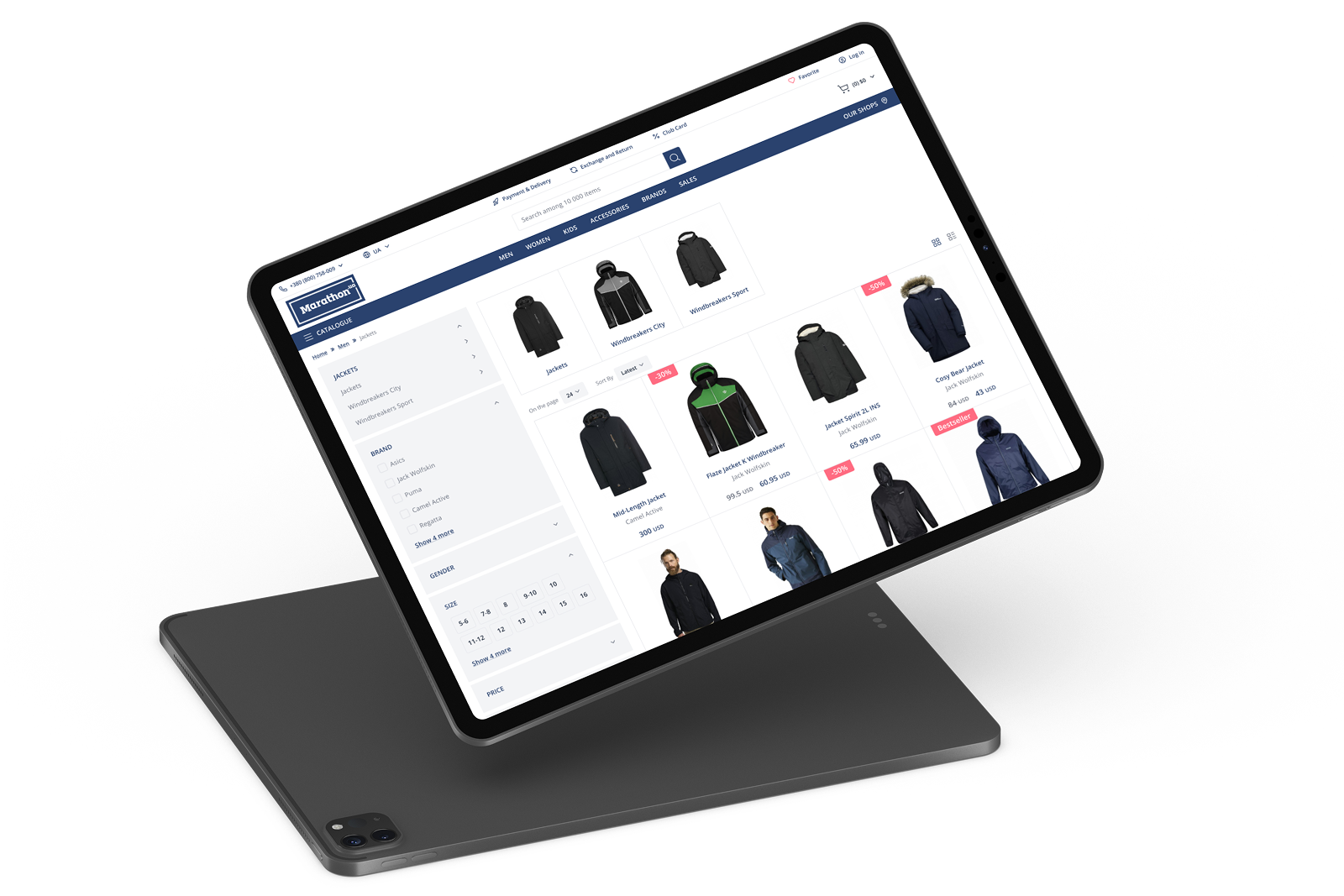 Tablet · Filtered catalogue
Most traffic is mobile, so the redesign is responsive from the ground up. Catalogue, product and the sticky buy bar reflow cleanly from desktop to phone — add-to-cart and favourite stay within thumb reach on the smallest screen.
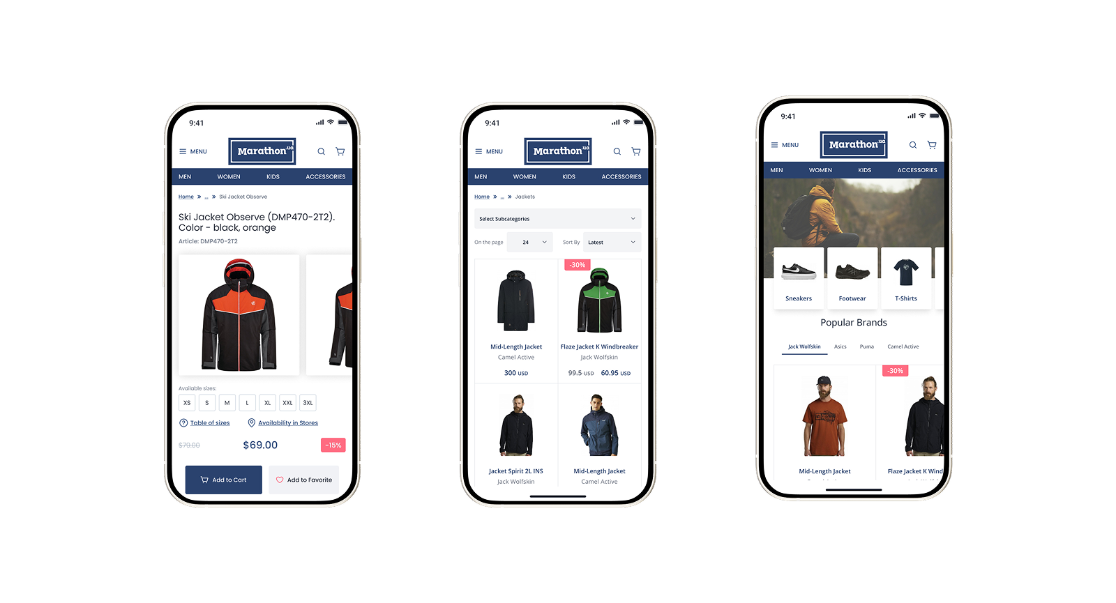 Mobile · Product, catalogue & home
Research surfaced a quiet behaviour with loud consequences: many shoppers loaded the shopping cart as a save-for-later list — or to plan an in-store visit — simply because the platform had no way to bookmark a product. The cart looked busy; intent to buy was being misread. Adding a dedicated ‘Add to Favourite’ gave that intent its own home and let the cart mean what it should.
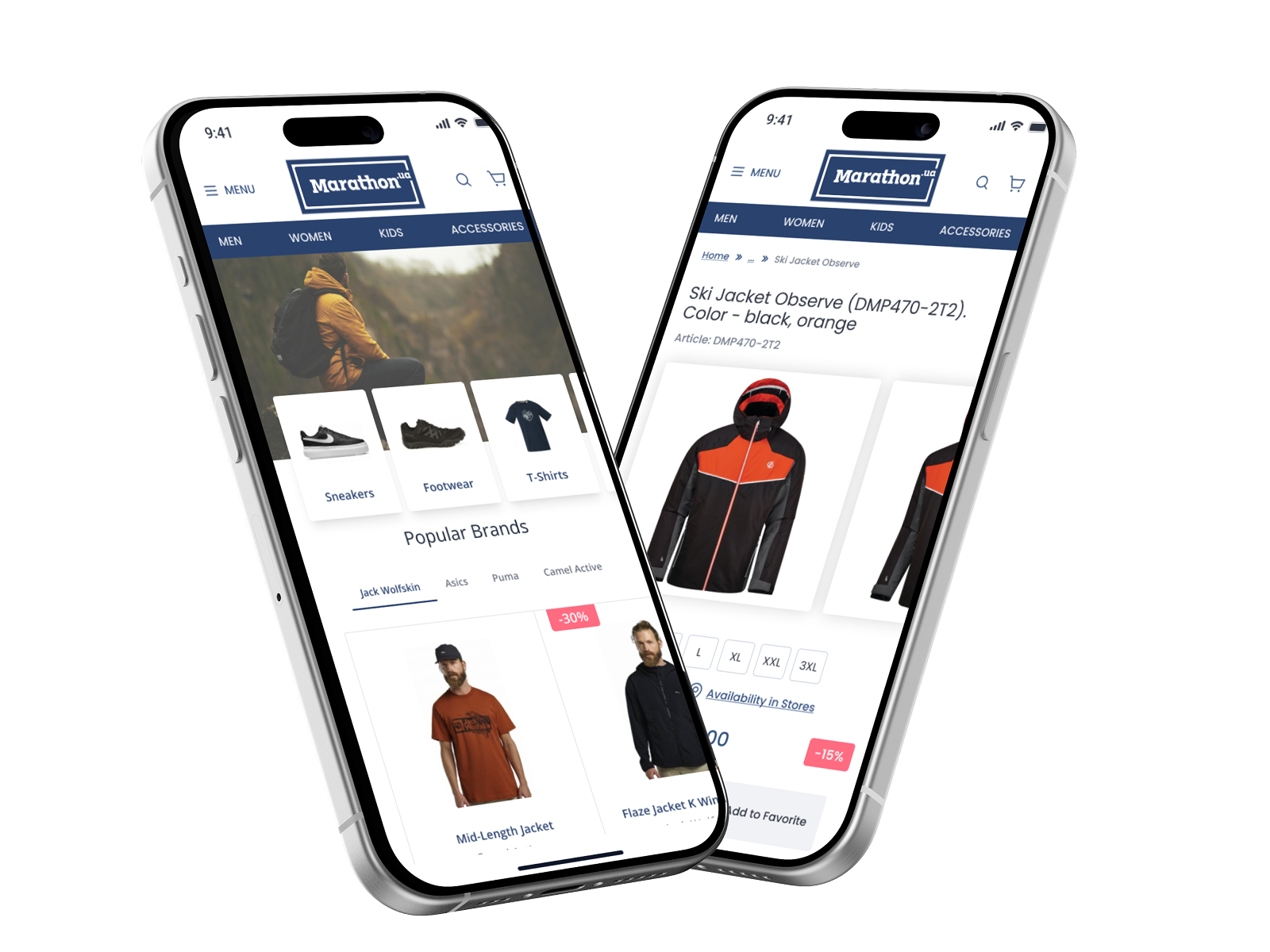 Mobile · ‘Add to Favourite’, born from research
Shared tokens, components and patterns that scale from mobile product cards to wide desktop catalogue grids — keeping the brand consistent while conversion takes priority.
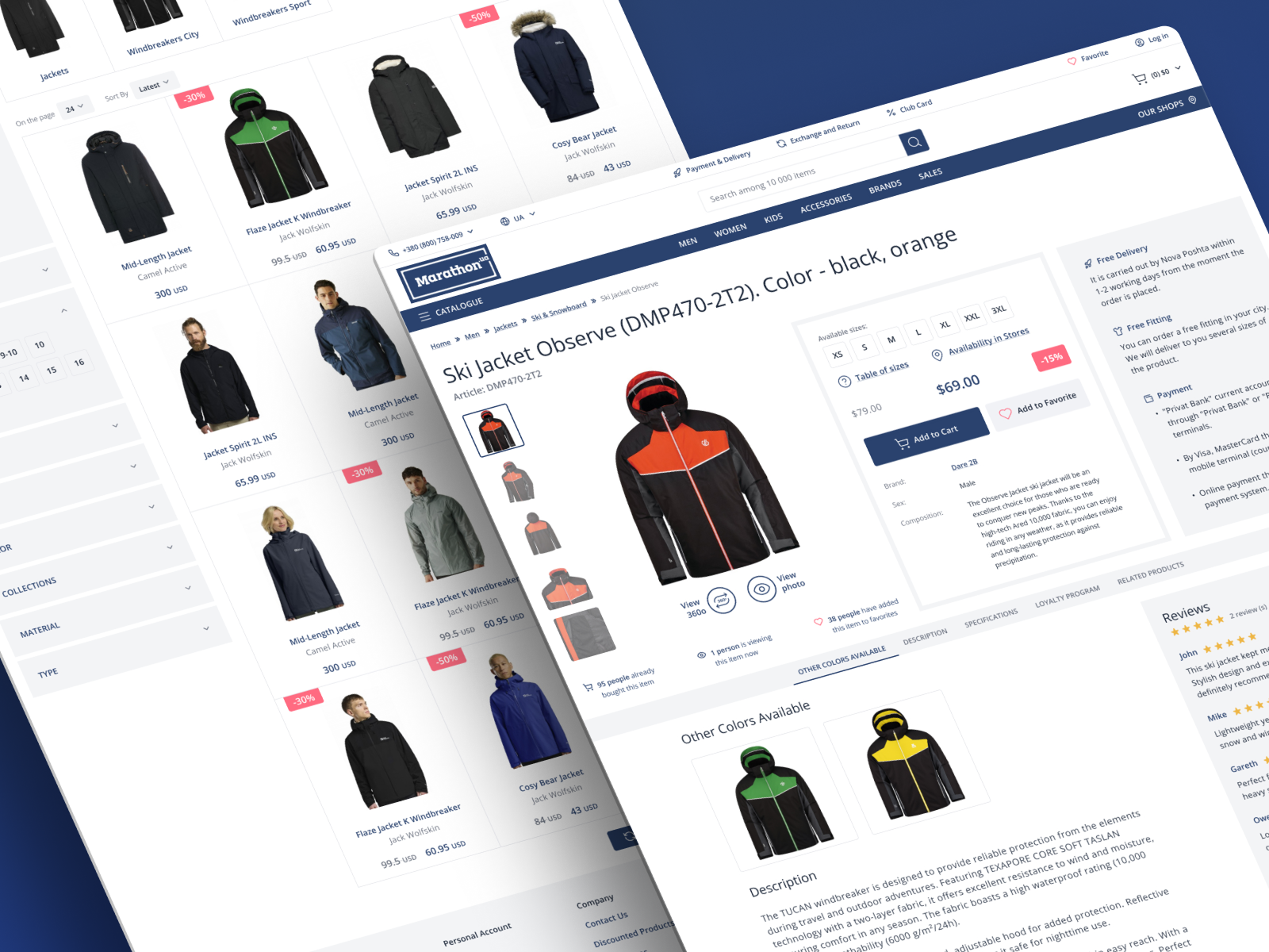 System · Catalogue & product, unified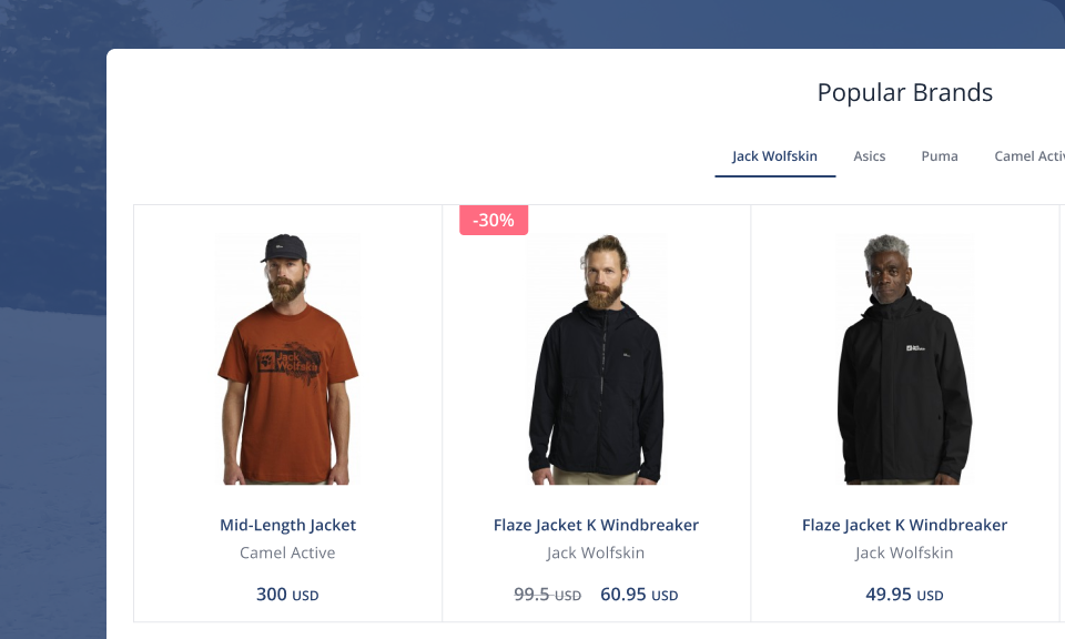
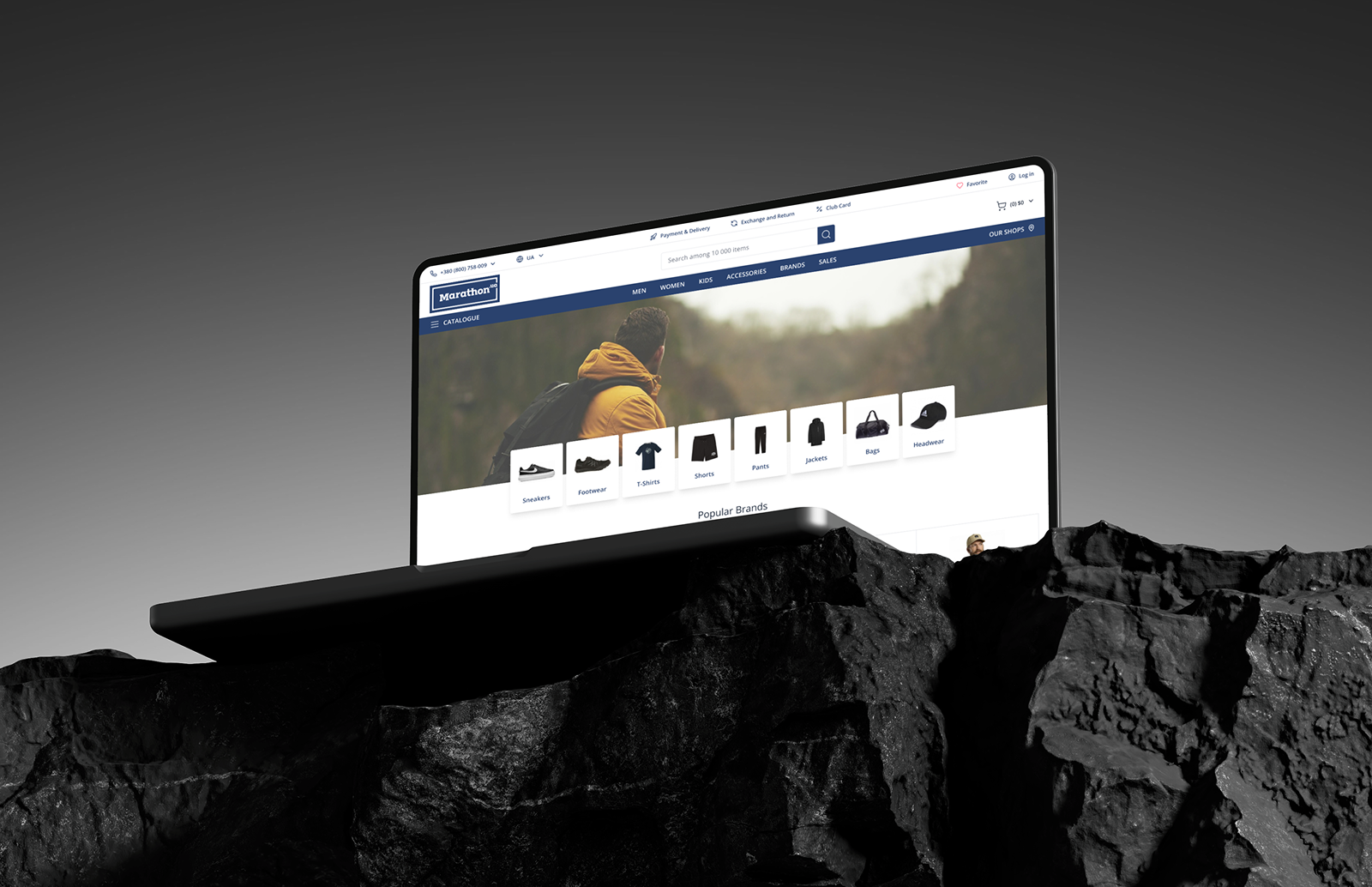
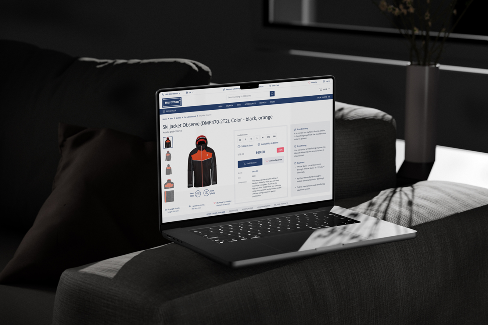 Built to convert — at the desk, on the sofa, on the go
The redesign contributed to measurable improvements across the core business indicators the brief was built around.
If UX debt is quietly costing you orders, I help retailers turn audits and research into redesigns that move the numbers.
Tell me about your project and I'll get back to you within 24 hours.