UX research & audit
Interviews, deployment analysis and a full audit of existing flows.
An end-to-end redesign of an open-source crisis-mapping and data-collection platform — simplifying how teams build deployments, surveys and submission forms, without giving up the configurability that makes it powerful.
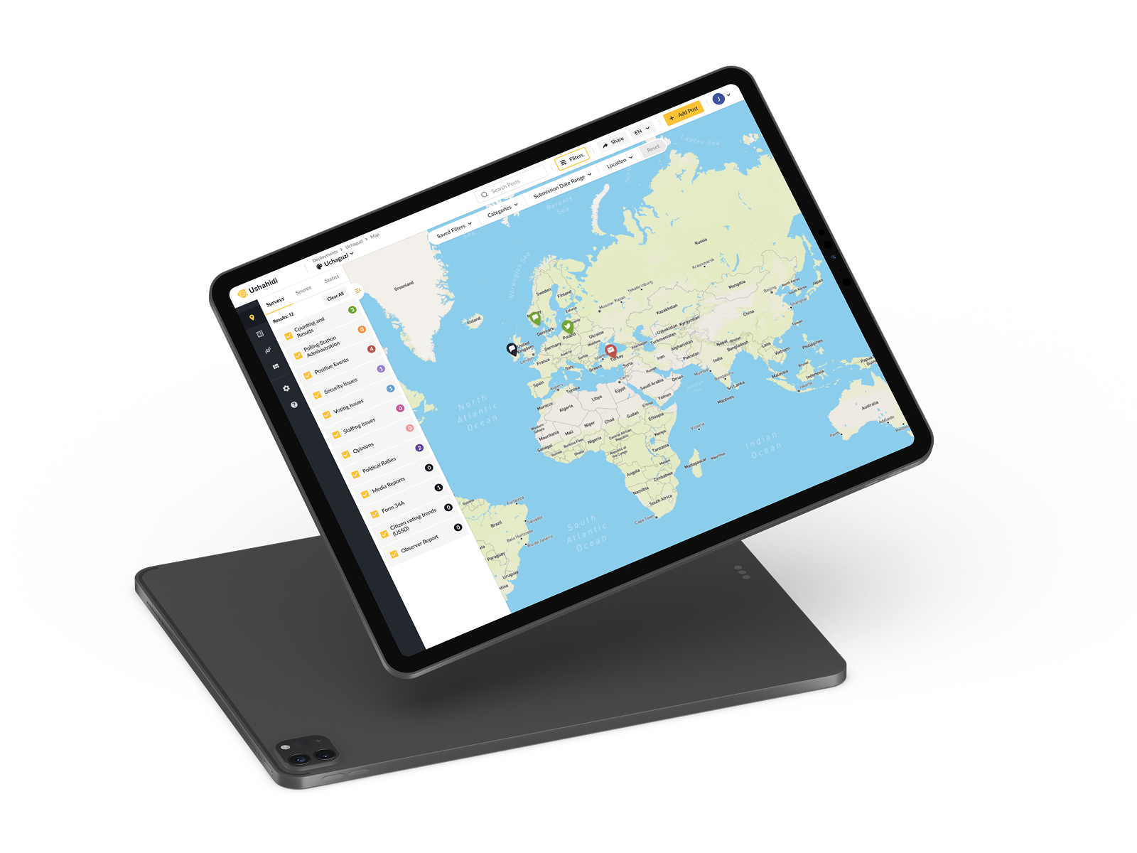
Ushahidi is an open-source platform used for election monitoring, crisis response, humanitarian work and large-scale research. Organisations spin up custom deployments where participants submit reports through web, mobile, SMS and messaging apps.
That flexibility is the product's superpower — and its tax. Every deployment, survey, category and submission form can be shaped to fit a wildly different use case, and over time those workflows had grown hard to navigate. My role was to simplify the experience without removing the configuration teams depend on — working closely with stakeholders and real deployment users along the way.
Interviews, deployment analysis and a full audit of existing flows.
Defining a path to simplicity without removing power-user capability.
Re-mapped the structure of deployments, surveys and submissions.
End-to-end screen design for web, admin and submission surfaces.
Shared tokens and components spanning all platforms and channels.
Native iOS and Android apps for submitting and reviewing reports.
Simplified the most-used admin tasks: deployment setup, form building.
Close work with the Ushahidi team and deployment users throughout.
Supporting elections, disasters and research from a single platform created real complexity. The workflows for creating deployments, surveys, categories and submission forms had become difficult to navigate — powerful, but intimidating. The task was to simplify them without taking away the configuration teams rely on.
The same principle across every surface: reveal one decision at a time, keep powerful options within reach, and let the map and the data do the talking.
New users land in a clear, paced flow — search for their deployment, pick it from a list, and add it to their account — with a skippable path for anyone who wants to explore first.
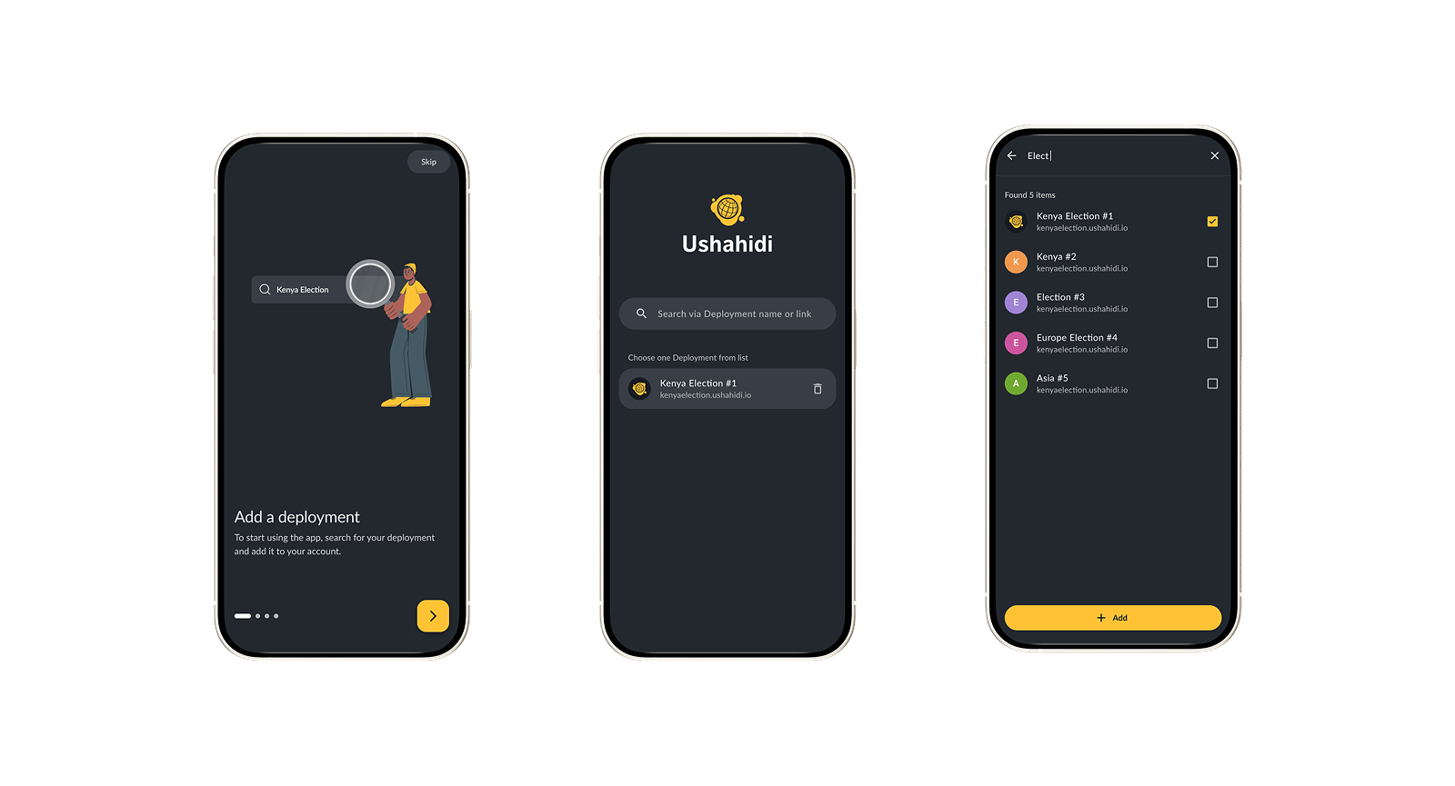 Mobile · Add a deployment
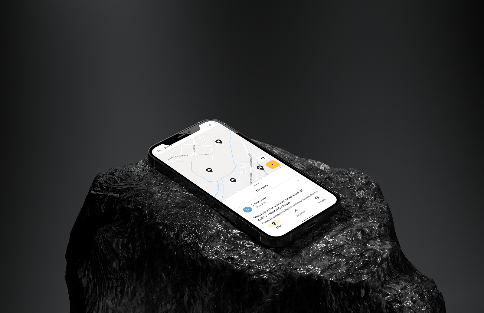
The core view puts incoming reports on a map, with a category-coded survey list down the left and filters for source, status, date and location across the top — so a flood of submissions stays readable.
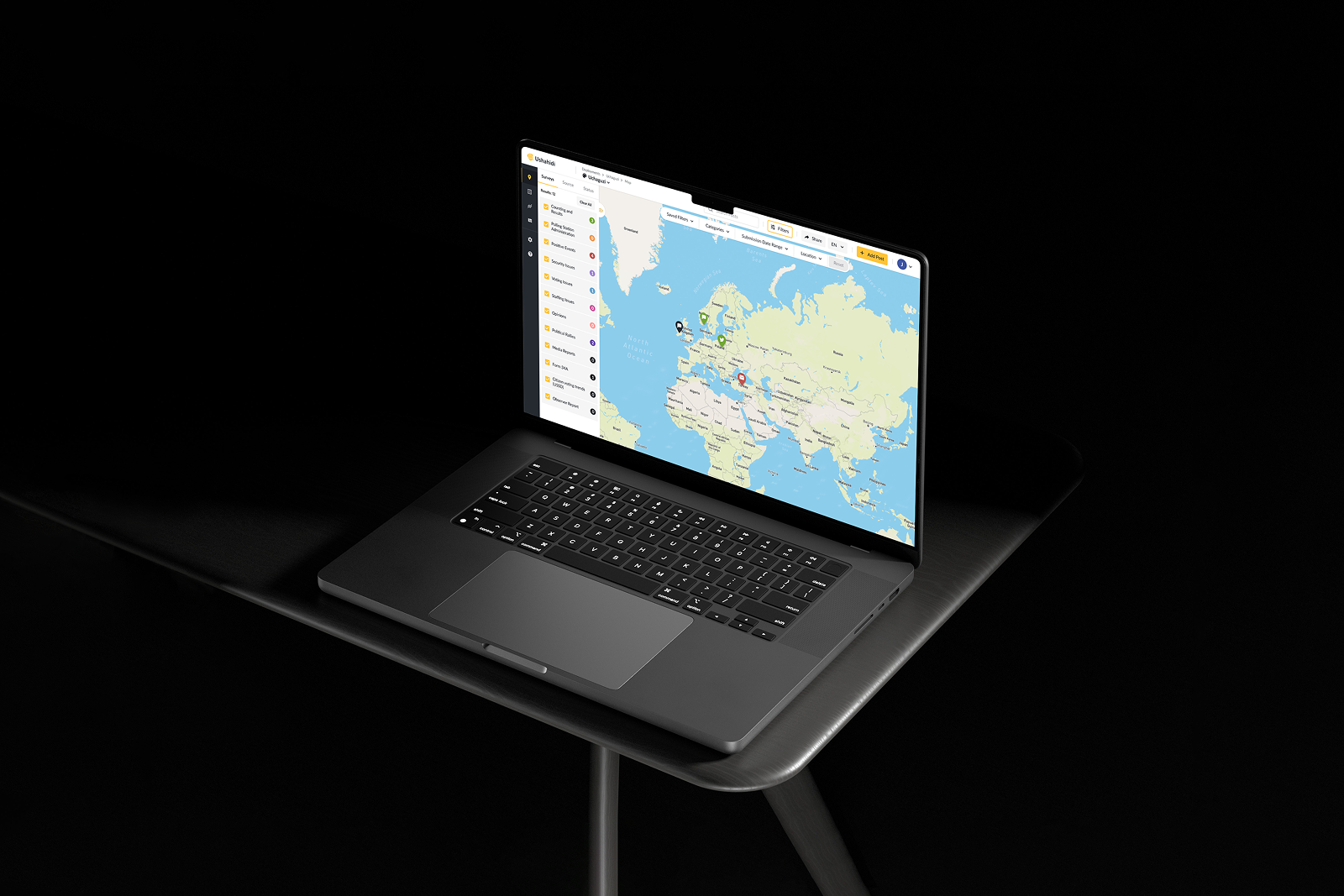 Web · Deployment map
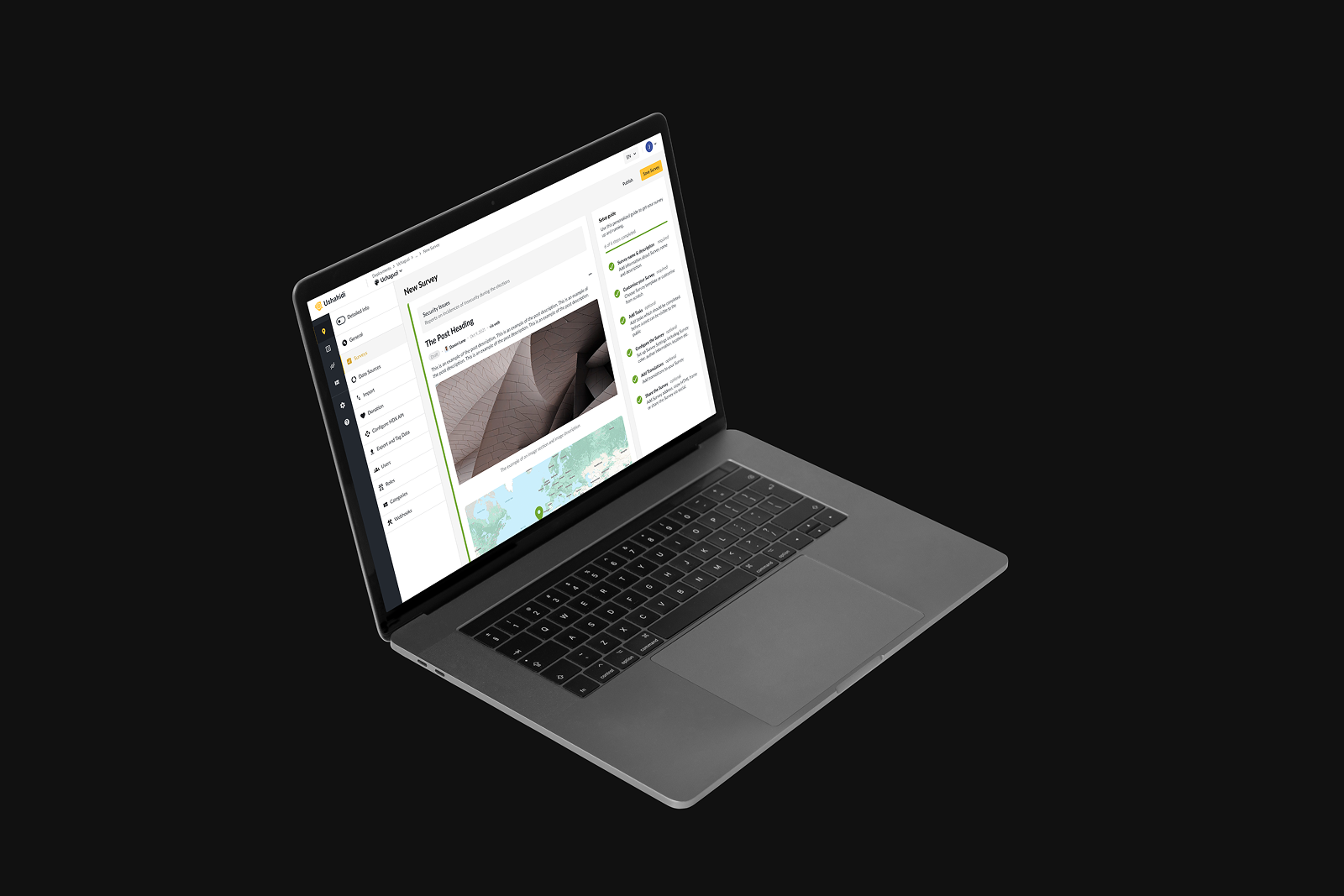
Building a survey used to mean wrestling with scattered settings. Now it's a guided builder: name and describe the survey, drag in field types from a clear menu, and translate it into any language — each step tracked in a side checklist.
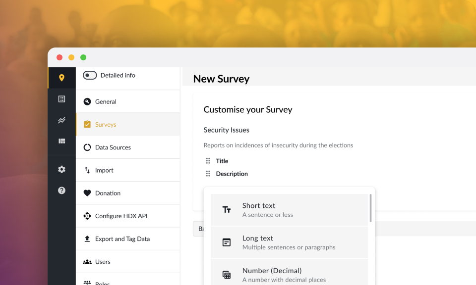 Admin · Field types
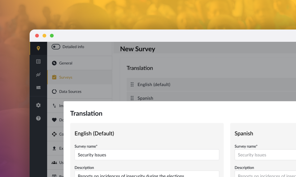 Admin · Translations
Whether a citizen files from the field on mobile or a coordinator reviews on the web, a post shares one structure — title, description, incident date, location and media — so submissions stay consistent and easy to verify.
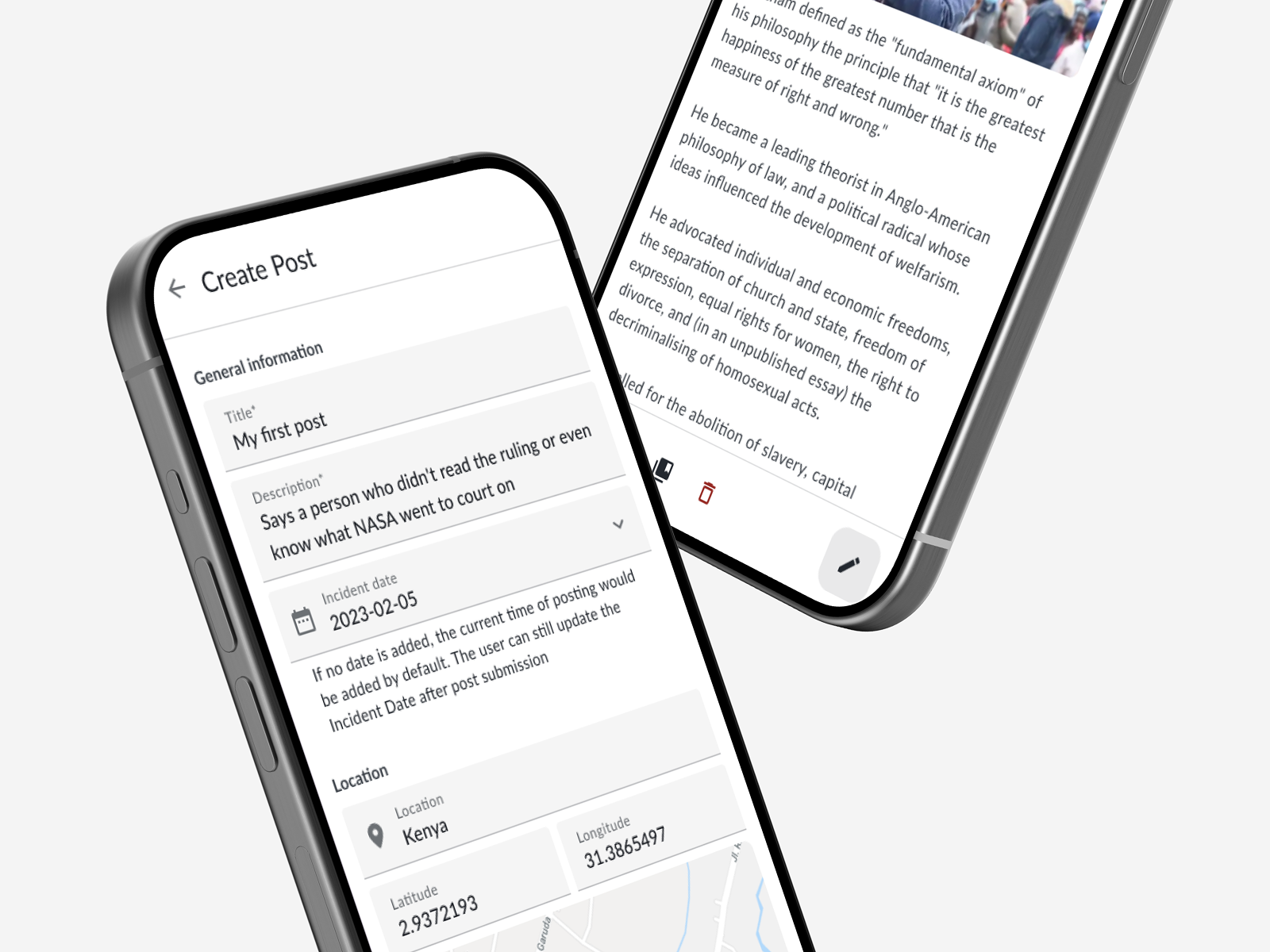 Mobile · Create post
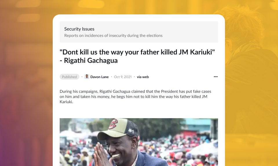 Web · Post detail
A shared system of tokens and components keeps every surface consistent — from an admin dashboard to a mobile submission form to an SMS reply.
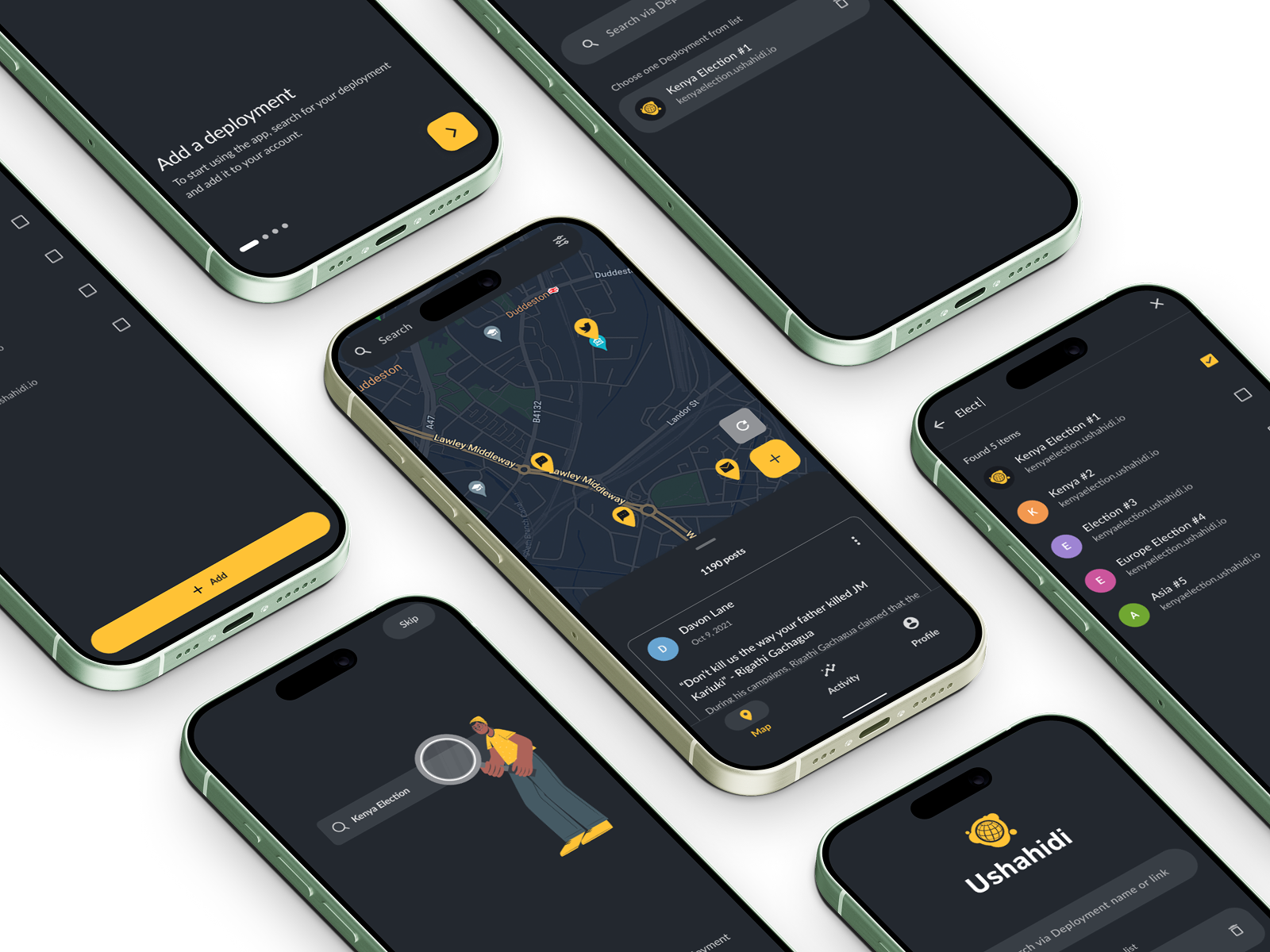 Mobile · The redesigned app system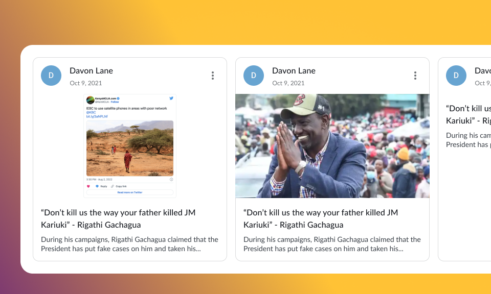
 Built for the field — elections, disasters & citizen reporting
If your product is configurable to a fault and the workflows have outgrown the UI, that's exactly the knot I like to untangle.
Tell me about your project and I'll get back to you within 24 hours.