UX audit & analysis
Full evaluation of existing flows, inconsistencies and opportunities.
An enterprise-wide redesign of a renewable-energy forecasting platform — unifying years of divergent dashboards, analytics tools and mobile apps under one modular design system.
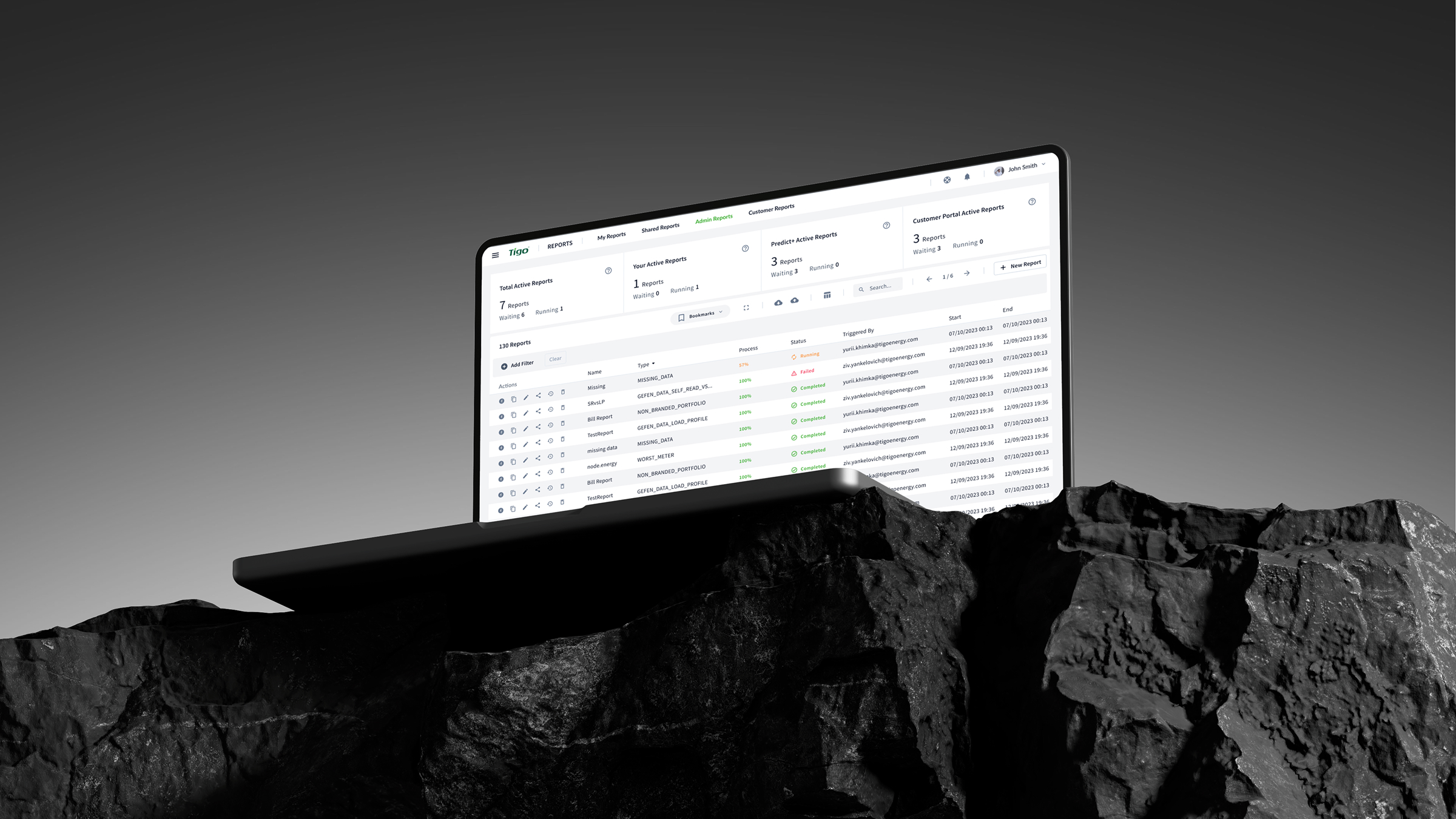 Predict+ · Reports & admin
Tigo Energy is a renewable-energy company. Its platform helps businesses forecast energy generation and consumption, analyse performance data, and make operational decisions with confidence.
The ecosystem ran deep: complex dashboards, reporting systems, analytics tools, advanced filtering, data tables, custom dashboard builders and mobile apps — serving both enterprise clients and individual solar-equipment owners. My job was to make all of it feel like one product.
Full evaluation of existing flows, inconsistencies and opportunities.
Defining the approach to unify a multi-product platform.
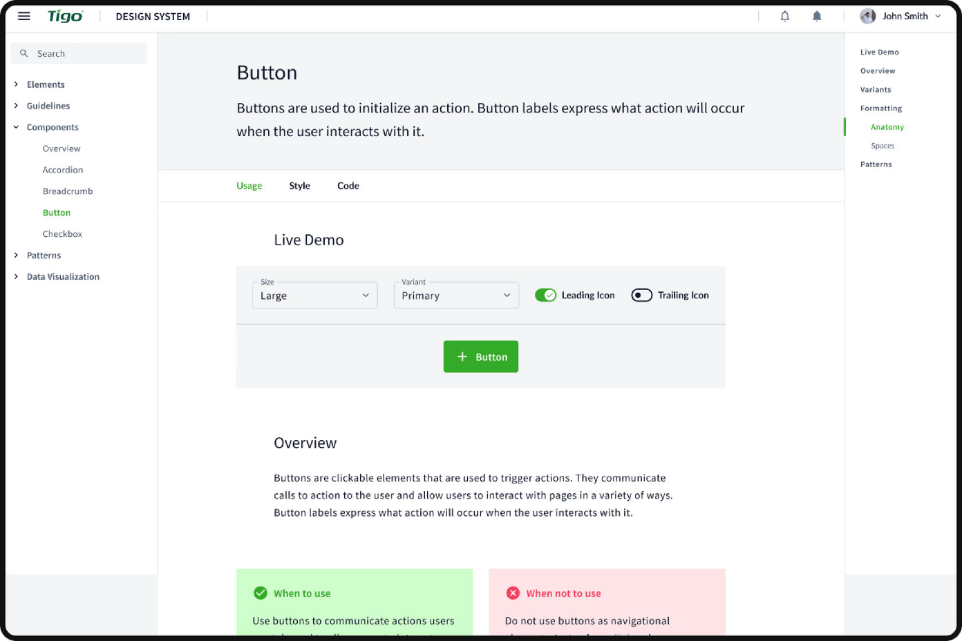
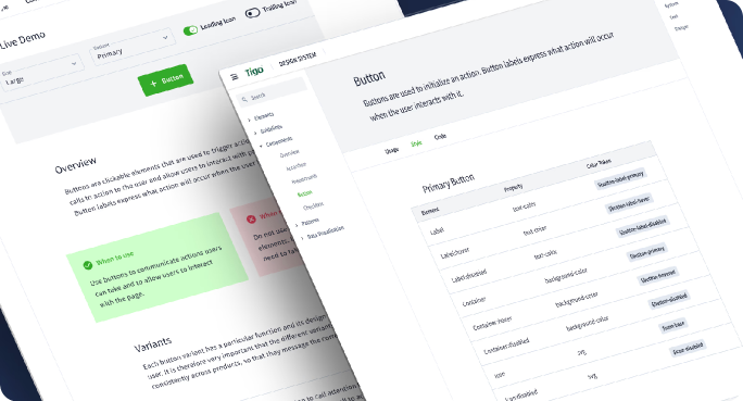
Tokens, components and patterns documented across all surfaces.
Re-structured navigation and entity relationships across sections.
Custom dashboard builders, data visualisation and reporting UI.
iOS and Android apps for homeowners monitoring solar systems.
Marketing and product pages aligned with the new design language.
Working with enterprise clients and internal teams to validate decisions.
The platform had evolved over many years with no unified design system. Different sections used different approaches, creating significant inconsistency — all while carrying large volumes of data, advanced filtering, complex tables and specialised enterprise workflows.
After a comprehensive UX audit and stakeholder feedback sessions, I built a modular design system around reusable components and consistent principles — a scalable foundation the team could keep building on.
Market Insights lets analysts assemble their own views — charts, gauges and KPI tiles drag into a responsive grid, every widget drawn from the same component kit.
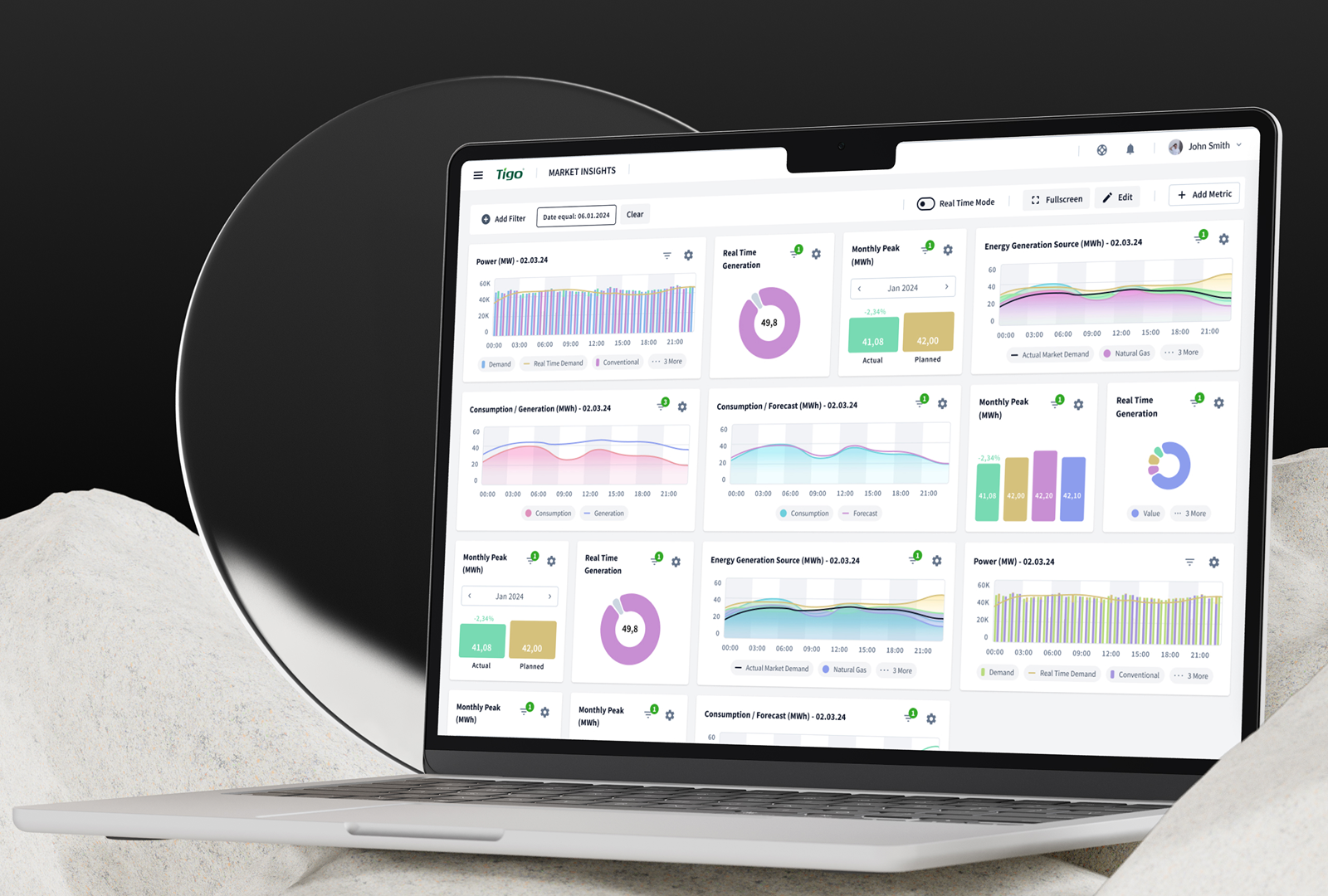 Predict+ · Market Insights builder
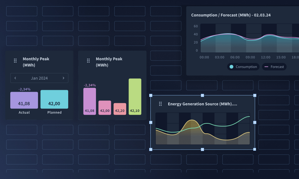 Edit mode · drag-and-drop grid
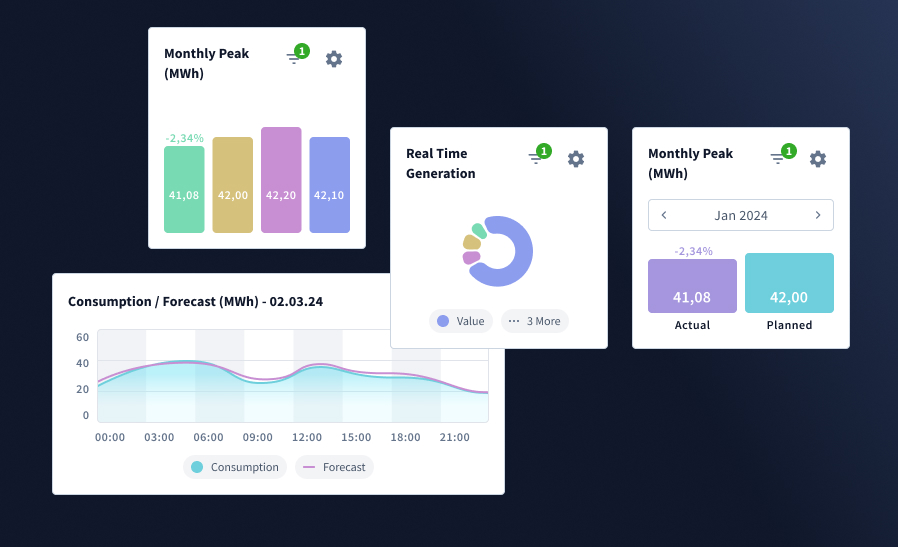 Widget kit · charts, gauges & KPIs
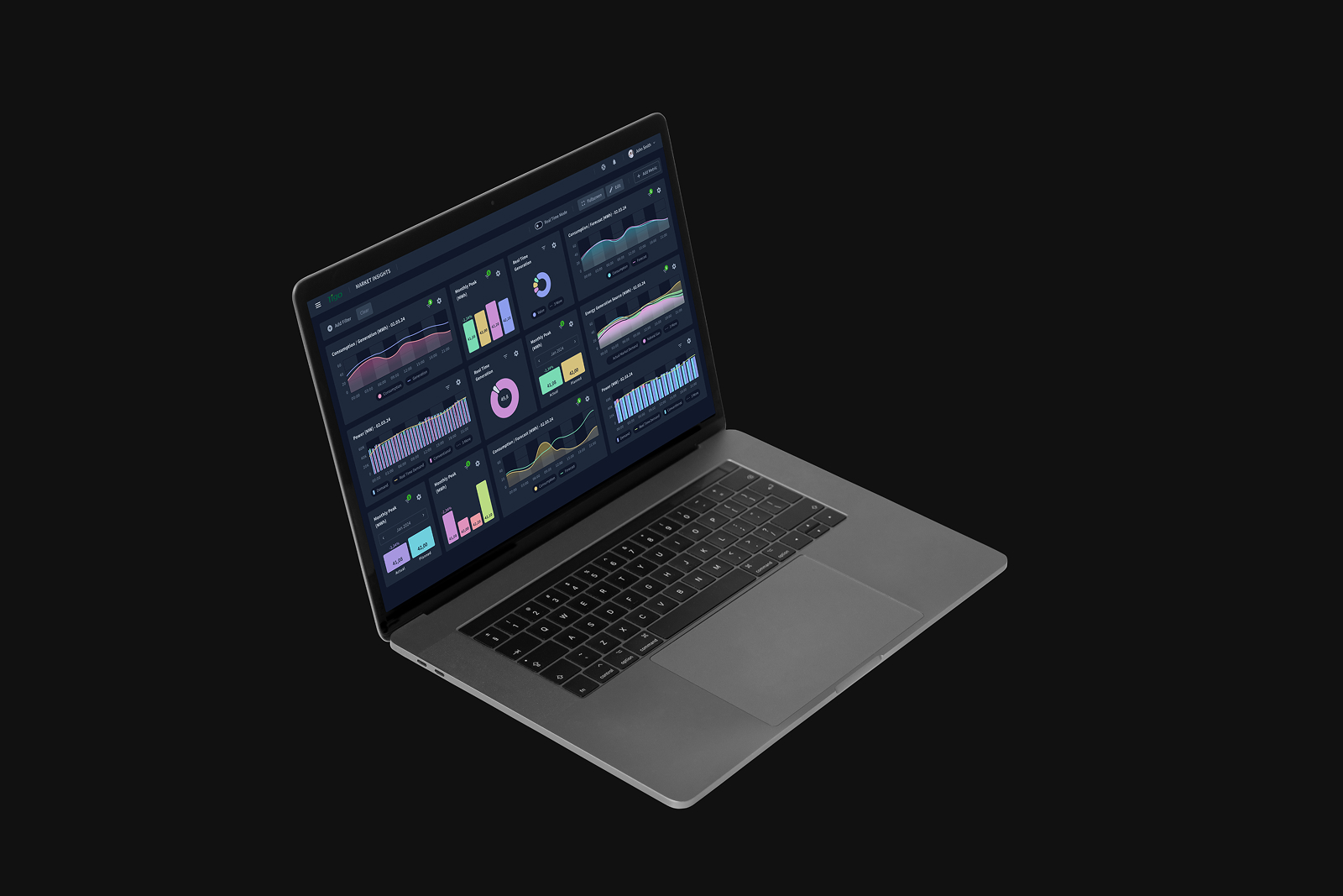 Predict+ · real-time mode
The trading and forecasting tools layer demand, generation and price curves over dense planning tables — heavy data made scannable through restrained colour and clear hierarchy.
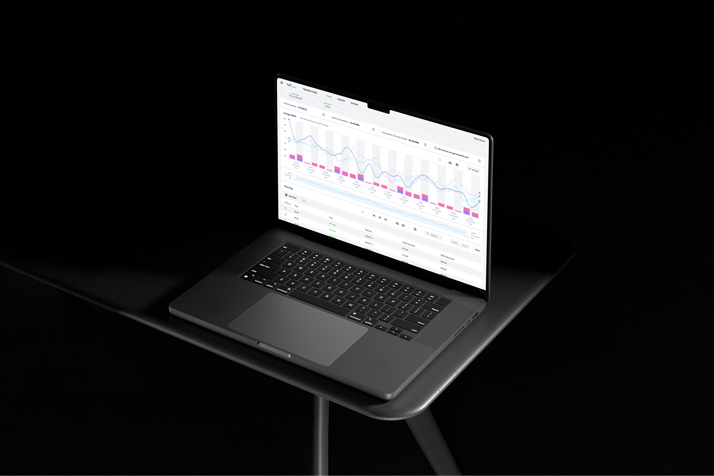 Trading Tool · Forecast & planning
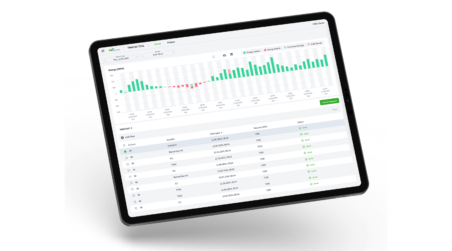 Trading Tool · tablet
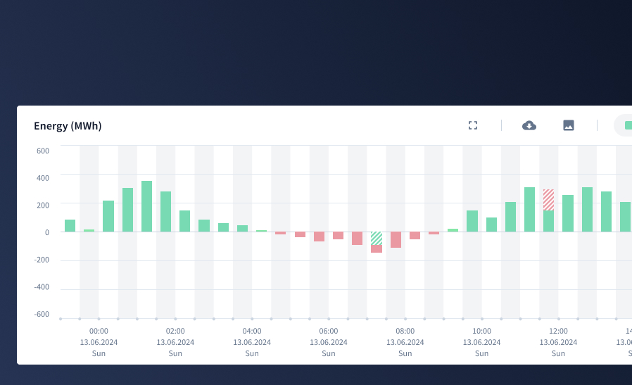 Energy · surplus vs deficit
Reporting and data-ingestion screens move hundreds of rows. Consistent density, sticky headers and a shared filter pattern keep them fast to scan and safe to operate.
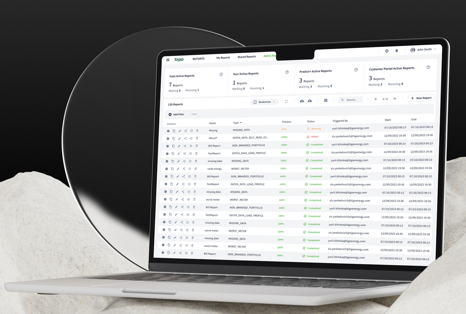 Reports · Admin
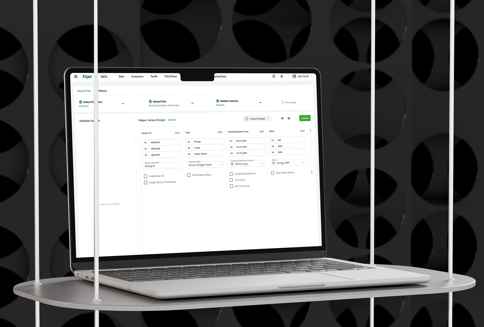 Data · column mapping
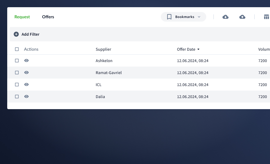 Trading · offers table
Enterprise customers manage payments, consumption and next-month forecasts in one place — summary cards up top, a full invoice ledger below, exceptions surfaced early.
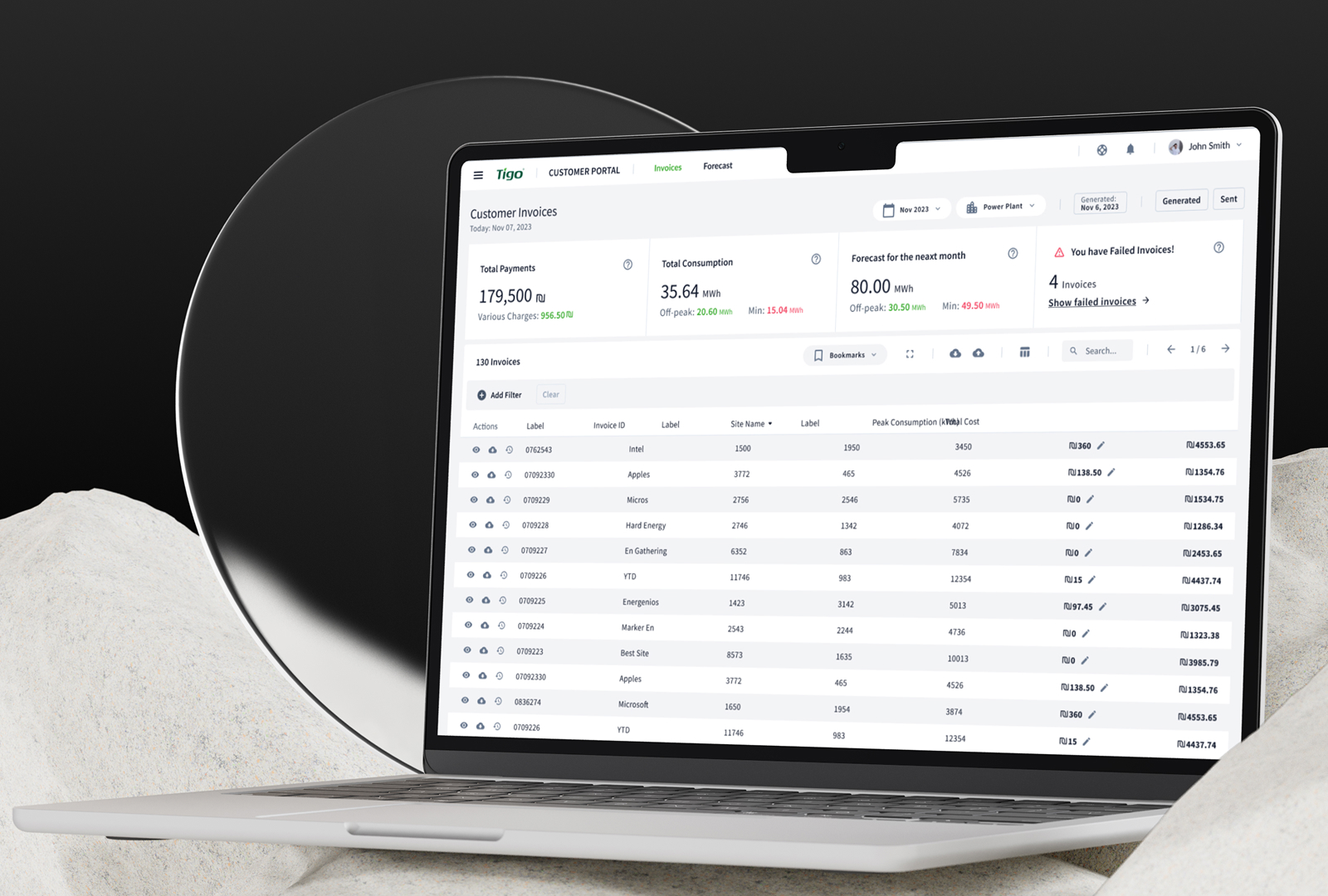 Customer Portal · Invoices
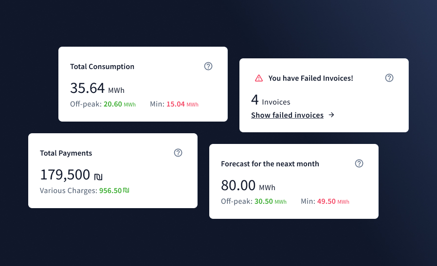 Portal · summary & alerts
The same system reaches individual solar owners — a focused mobile app and a light-theme monitoring view turn live power-flow data into something anyone can read at a glance.
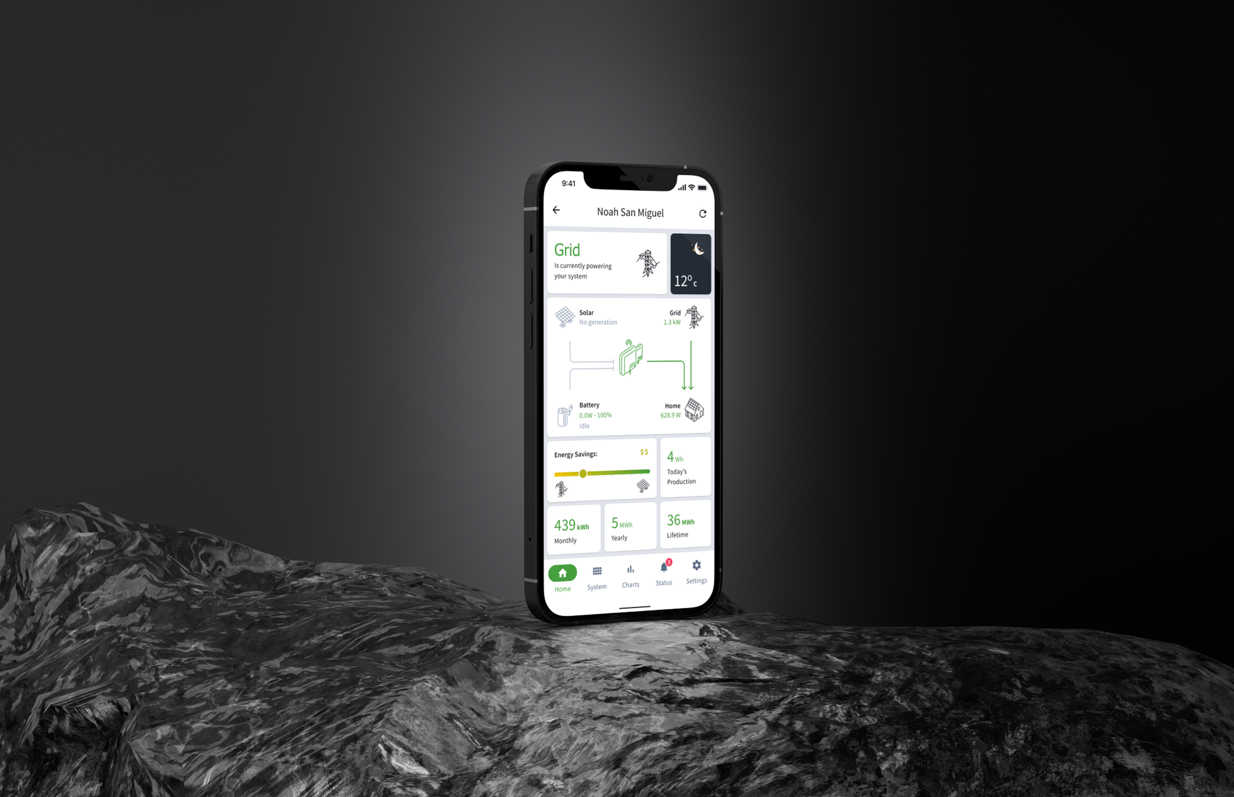 iOS · Homeowner app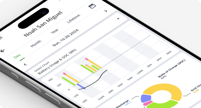
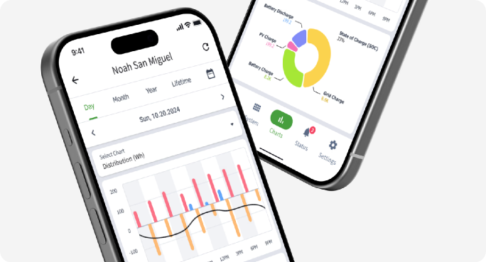
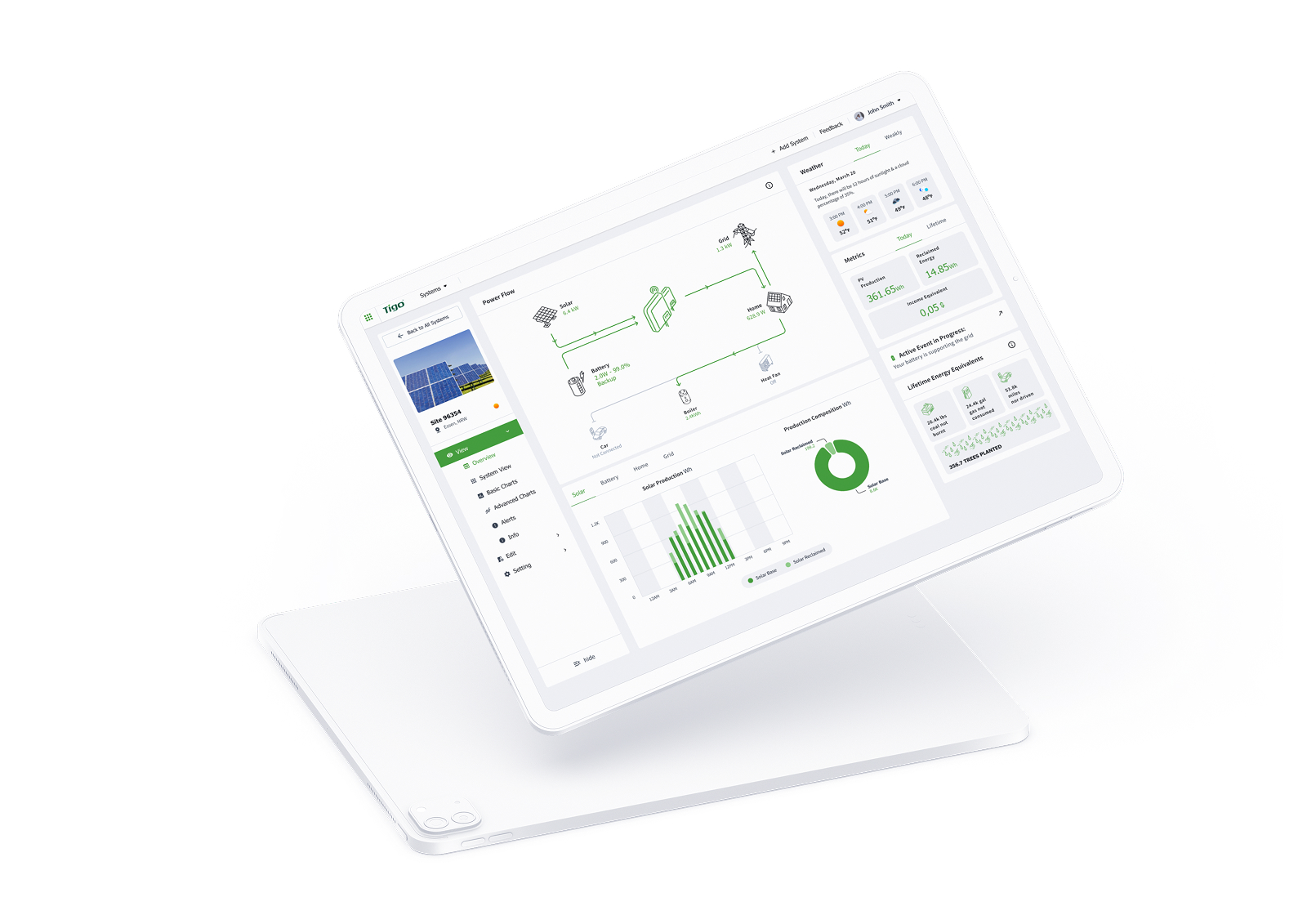 Web · System monitoring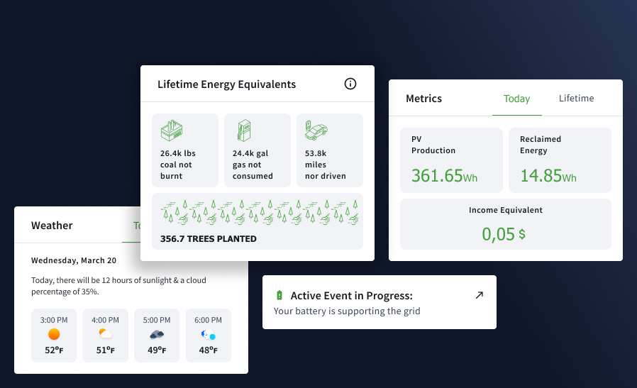
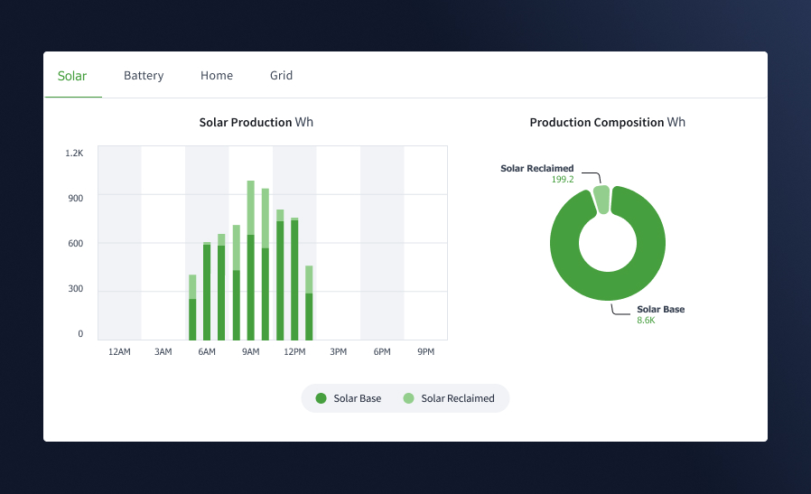
A modular system of tokens, charts and components keeps every surface consistent — from a real-time enterprise dashboard to a homeowner's phone.
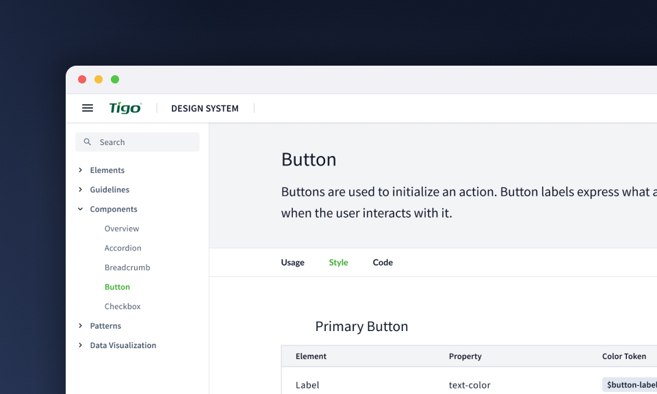
If years of features have left you with inconsistent, data-heavy screens, a modular design system is exactly the fix I build.
Tell me about your project and I'll get back to you within 24 hours.