Website redesign
Rebuilt the responsive web marketplace around search and discovery.
An end-to-end redesign of a roommate-matching marketplace — taming complex profiles, search and listing creation into an experience that feels effortless across mobile and web.
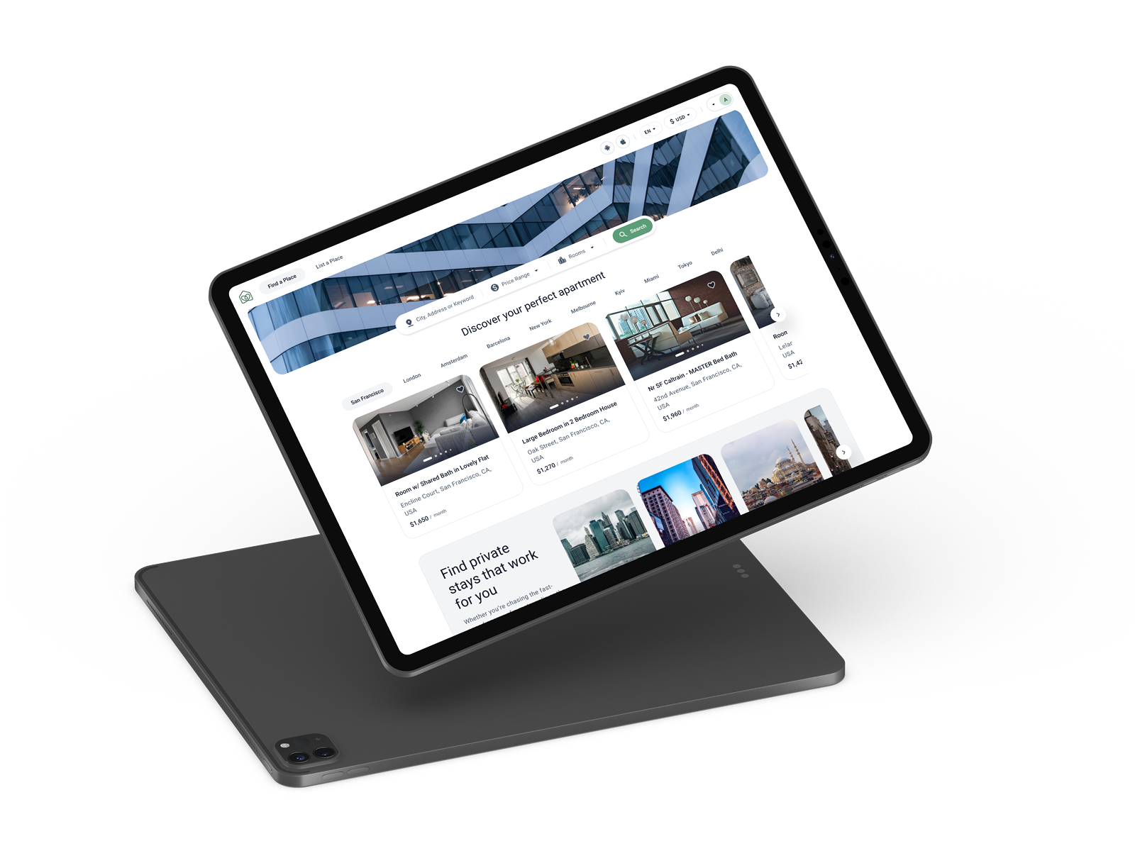
Roomster helps people find roommates, rooms for rent, and shared housing. The platform matches users on preferences, lifestyle and location — and that depth is its product moat.
But depth has a cost. Every quality match is built on rich profiles, structured search, granular filtering and detailed listings. Spread across iOS, Android and web, that information had outgrown its interface. My job was to keep the matching power while making each surface feel light.
Rebuilt the responsive web marketplace around search and discovery.
A shared token, component and pattern library across all platforms.
Native iOS and Android flows rethought from onboarding to chat.
Cut friction from high-effort tasks like listing creation and filtering.
Re-mapped navigation, content hierarchy and entity relationships.
Smoother paths from sign-up to first match, message and booking.
High-quality matching needs a lot of input: preferences, lifestyle, budgets, photos, house rules. But every extra field is a chance to abandon — especially during onboarding and listing creation, where too much complexity quietly kills conversion.
Across every surface, the same principle: ask for one thing at a time, show progress, and let real content — photos, places, people — carry the weight.
The most information-heavy moments — creating an account and listing a room — are sequenced into focused steps, each carrying a single ask and a visible progress bar.
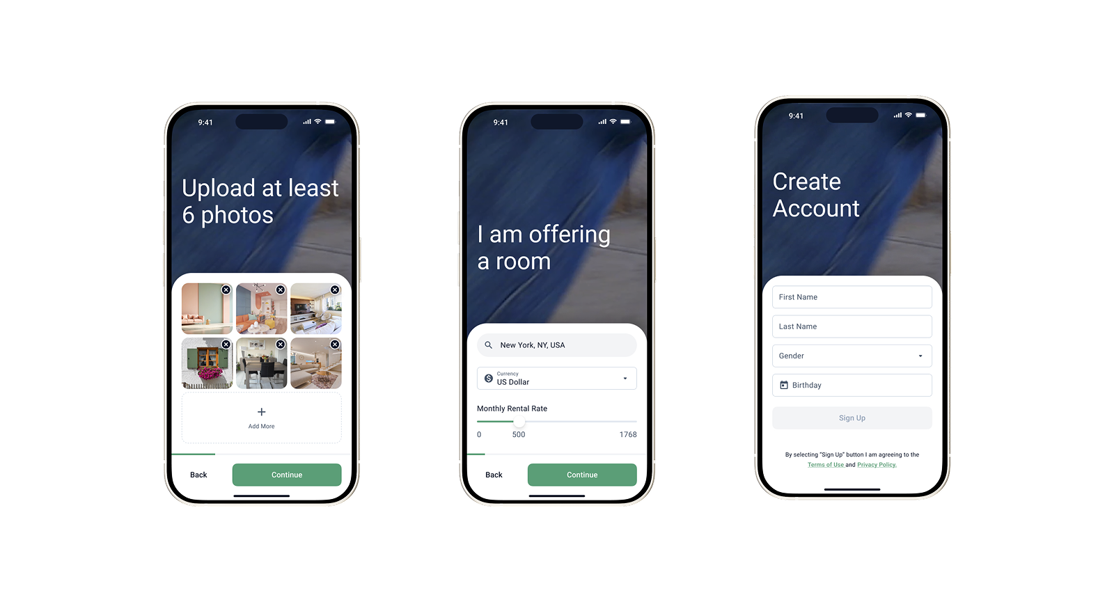 iOS · Listing & sign-up flow
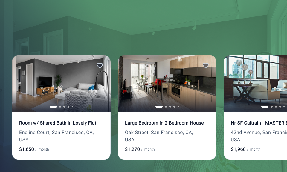
The web home leads with a single search bar, city shortcuts and rich listing cards — putting results and imagery first, with price, rooms and keyword filters one tap away.
 Web · Discover
A listing carries gallery, host, price, amenities, full description and roommate preferences. A sticky photo header with a draggable detail sheet lets people skim or dive, at their pace.
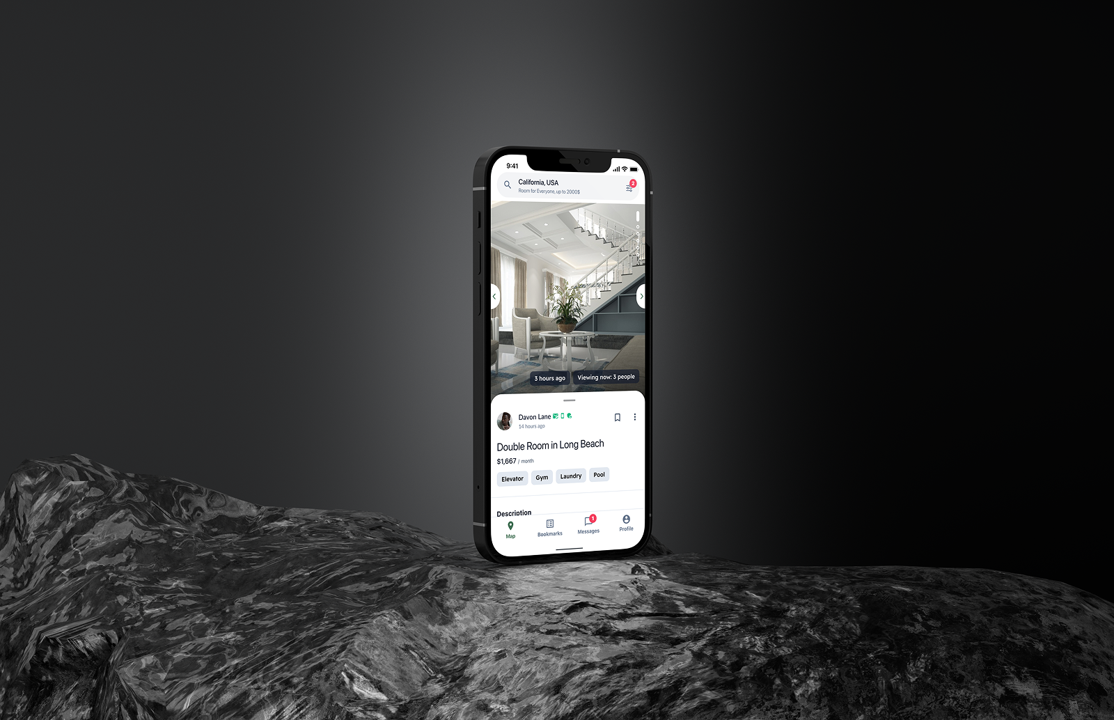 iOS · Listing detail
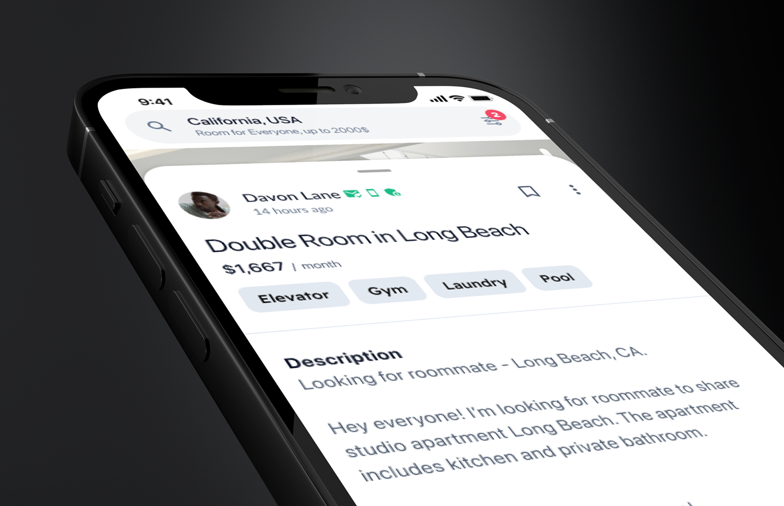 Detail sheet · Host & description
Matching only matters if people can talk. The inbox separates active and archived threads, shows presence and read receipts, and surfaces safety guidance right inside the chat.
 iOS · Messages
A shared system of tokens and components keeps every surface consistent — the same green, the same cards, the same rhythm whether you're on a phone or a desktop.


If your product needs to stay powerful while feeling simple, that's exactly the problem I like to solve.
Tell me about your project and I'll get back to you within 24 hours.